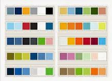
 WebOriginate Makes a Good use of colours in a website goes a long way in creating the lasting impression on the visitor.
Choose right colours depending on the colour scheme followed by the company, the logo colour etc.
WebOriginate Makes a Good use of colours in a website goes a long way in creating the lasting impression on the visitor.
Choose right colours depending on the colour scheme followed by the company, the logo colour etc.This is an important part of designing.
Give priority to natural colours:
It is true that nothing can beat the color palette of nature. The natural shades are more attractive and relates to human emotions. It is advisable to choose natural colours.
Colours for text content:
It is not recommended for the text colour to be light. If the text colour used is light, there are lots of possibilities that visitors will be annoyed as the readability will be low and thus bounce rate will increase.
Keep strong contrast between background and text content:
This is the best way to make the web pages more readable without any strain for reader’s eyes. This will in turn increase the hits.
Keep White Spacing:
White is a universally approved color which is helpful to keep the visual energy in a website. Try to use white spaces for balancing the web page.
Avoid fatigue Colors:
It is the duty of a designer to create something unique to attract visitors. Colour groupings such as blue and red, blue and yellow, red and green etc are considered as fatigue colors so avoid over usage of such colors.


No comments:
Post a Comment